- On this page
- Header
- Banner
- Breadcrumbs
- Nav
- Side Nav
- Grid snippets
- Grid snippets with images
- Expandables
- Forms
Header

This component is used to display current branch logo, provide a link back to the MPI site home page, login information page, contact information page, ability to search the site, and navigate through to any page using the primary navigation.


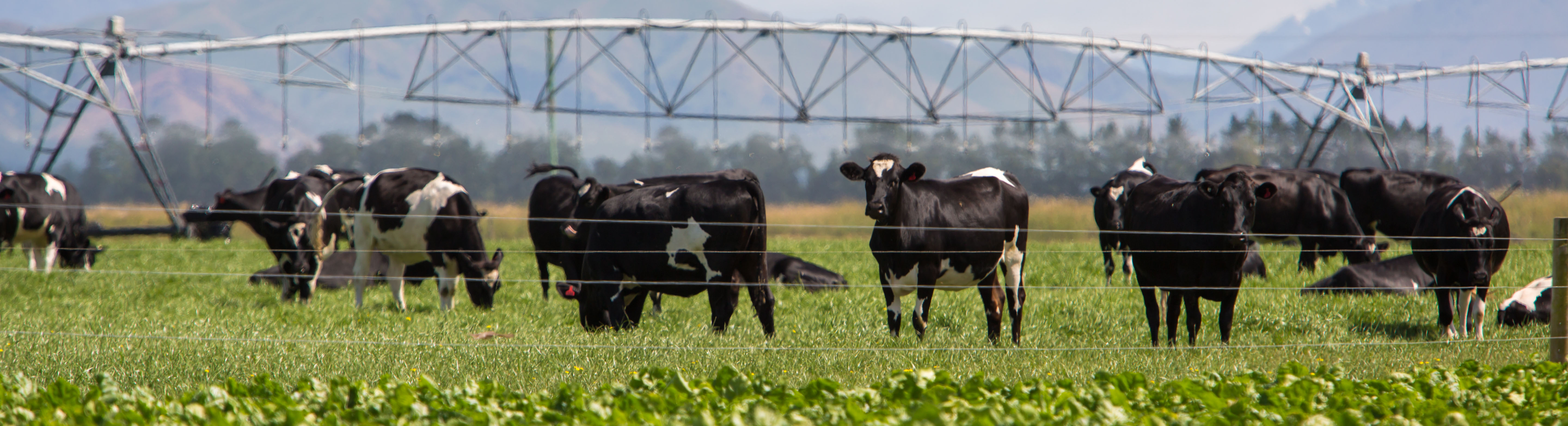
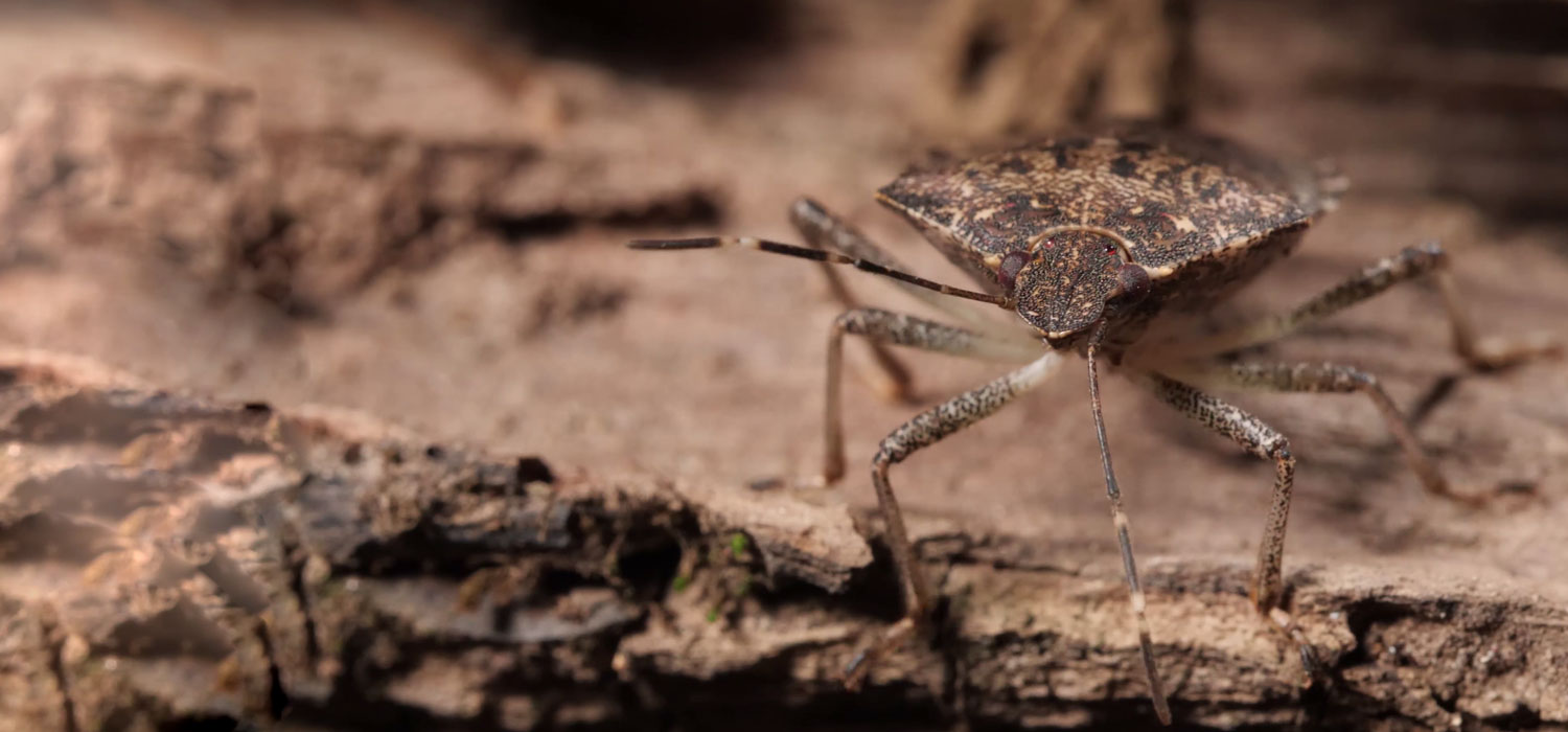
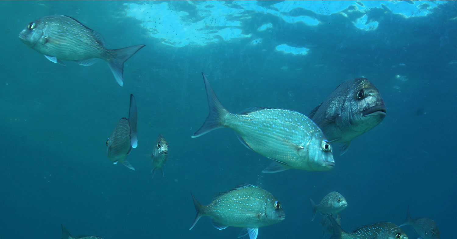
Banner

This component is primarily used to hold branch banner (Refer to the Imagery section of the Brand Style Guide). Content authors also have the ability to override this by uploading a hero image and choosing the option to the banner image as a banner.


Breadcrumbs

This component displays the current page path, in addition to social media sharing.
Details
Elements.breadcrumbs
.breadcrumbs__wrapper
.breadcrumb-branch-logo
Components
Breadcrumbs.ss_breadcrumbs.scss
Imagery
Nav

This component allows visitors to navigate to top level pages, and child pages which are loaded on demand.
Details
ID#audience-navigation
Elements
.audience_dropdown_container
.audience-navigation__item
.audience_dropdown_container
Components
audienceNavigation.jsAudienceNavigation.ss
_audienceNav.scss
Side Nav
This component provides visitors a way to see where the content page currently being viewed sits within the rest of the site's content.

Details
Elements.sidebar
.sidebar-top
.sidebar-bottom
Components
SidebarNav.ss_sidebar.scss
Grid snippets

Details
Elements.grid-snippets
.snippet
Components
_snippet.scssElementAudienceNavigation.ss
Grid Snippets with images

Details
Elements.grid-snippets
.snippet
Components
ElementFeaturedItems.php_snippet.scss
ElementFeaturedItems.ss
FeaturedItem.ss
Expandables

Details
Elements
.expandable
.expanable-master
Components
ElementExpandableItemSet.php
_expandable.scss
ElementExpandableItem.ss
Forms
